Wedding Color Trends 2027: Why Wine, Chocolate Brown, and Powder Blue Are Everywhere
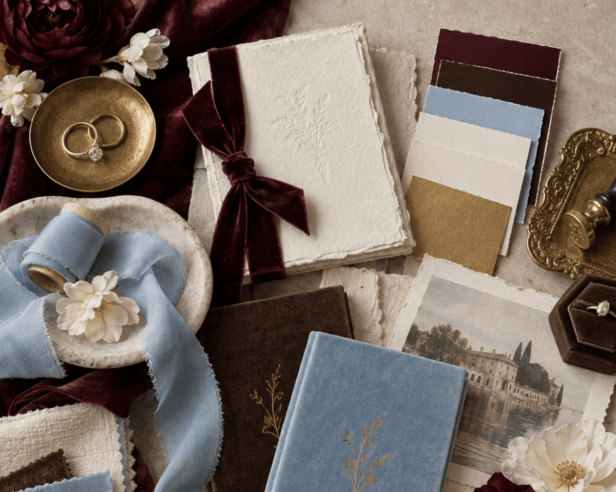
If your inspiration board from two years ago was all sage and dusty blush, next year is asking you to put it down. Couples booking venues for 2027 are reaching for richer, more saturated color: wine, chocolate brown, and a powder blue with real staying power. Pantone just named Cloud Dancer, a quiet, breathy white, its color of the year for 2026, calling it a response to feeling overstimulated and overcommitted. Weddings are doing the opposite. The couples planning next year want a palette with some weight to it: a glass of cabernet, a leather jacket worn in over years, a powder blue tie that reads crisp rather than babyish.
Here is why these three colors keep showing up together in real 2027 weddings, and how to build a full palette around them instead of picking one and hoping the rest follows.
Wine Is Back, and It's Moodier Than Your Last Wedding
The strongest signal on this one comes from the biggest wedding site there is. The Knot names deep reds the top wedding color trend for 2027, describing them as sumptuous merlots, velvety burgundies, and elegant garnets, and pairs the whole family with powder blue as its contrasting partner. Loverly calls the same family deep crimson, citing oxblood and wine tones specifically, and says couples are reaching for them when they want drama and depth, especially for fall and winter weddings.
Not every source agrees on how far it goes. The Wed argues the trend is already drifting from true burgundy toward what it calls berry red, lighter and juicier. The weight of opinion, and the traffic behind it, still favors a true wine tone: deep, a little brown at the edges, closer to a glass of cabernet than a red you would find on a fire truck.
If you already love a fabric in this family, you have seen this coming. Our Bordeaux Chateau quilted interior sits right in this range: deep, wine dark, closer to that same glass of cabernet. It is one of the few fabrics in the collection built for a couple who wants their wedding colors to read as grown up rather than sweet.
Chocolate Brown Is the New Luxury Neutral
Loverly calls chocolate brown the new black for weddings: grounded, cozy, and what they describe as interior design coded, meaning it reads like a room you would actually want to sit in rather than a theme. They pair it with cream, gold, butter yellow, and dusty rose rather than white, which keeps it from going flat. Wedding Decor gets specific about the shade itself, pointing to a deep chocolate around #50372E rather than a lighter latte or mocha.
Brown works here because it does what gold used to do: it grounds a bright color without competing with it. Wine on its own can read heavy. Wine next to chocolate, cream, and a little gold reads intentional, like a palette someone built on purpose rather than one pulled off a mood board two weeks before the wedding.
It is also the easiest color on this list to bring into a fall or winter wedding without touching a single seasonal cliche: no orange leaves required, no pumpkin anything.

The Blue Everyone Is Reaching For: Powder Blue
Powder blue, sometimes called French blue, is the shade The Knot names as deep red's actual match for 2027, calling it the trend's natural partner. Loverly backs the same shade, describing it as a cool girl classic making a strong comeback, timeless but feeling fresh again rather than tired.
The reason it works next to wine and chocolate is contrast, not matching. Deep red and brown carry all the weight in a palette; powder blue is the one cool, quiet note that keeps the whole thing from reading like a single, heavy color story. It is also the easiest of the three to put on a bridesmaid or a guest without asking anyone to commit to a bold statement color.
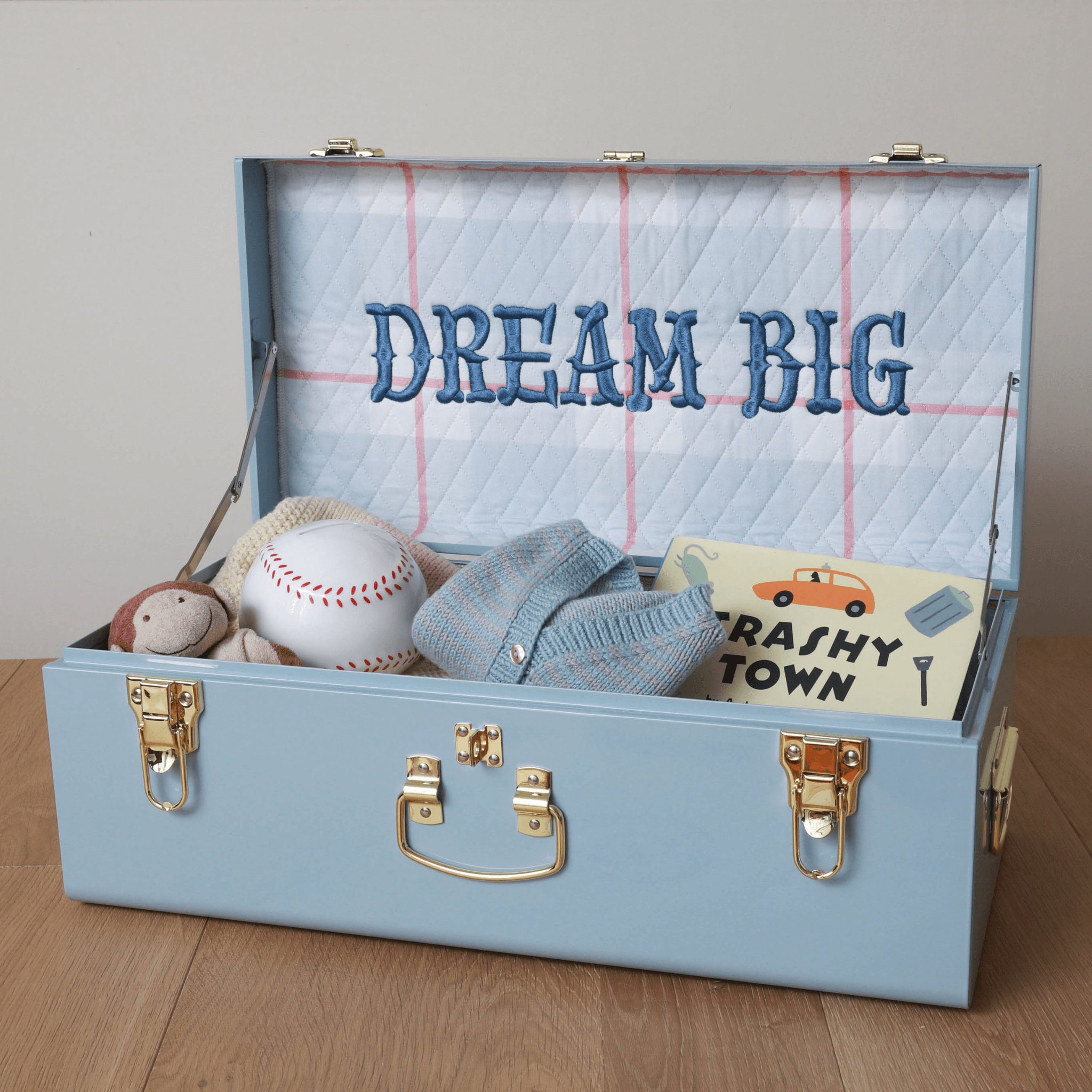
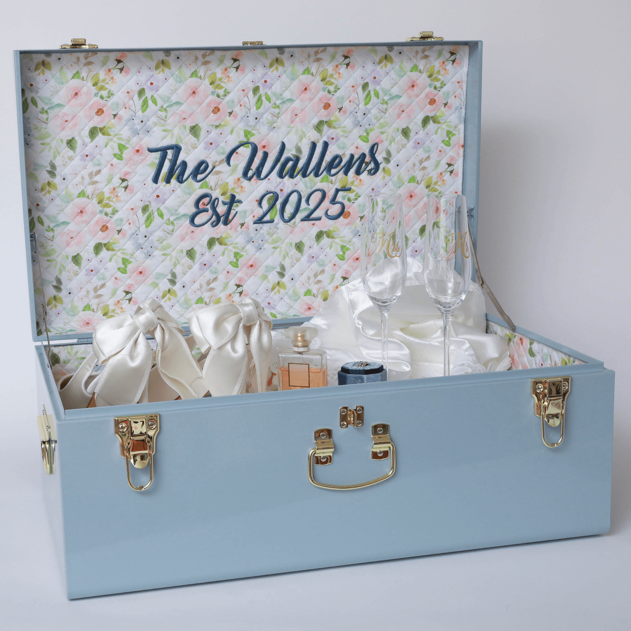
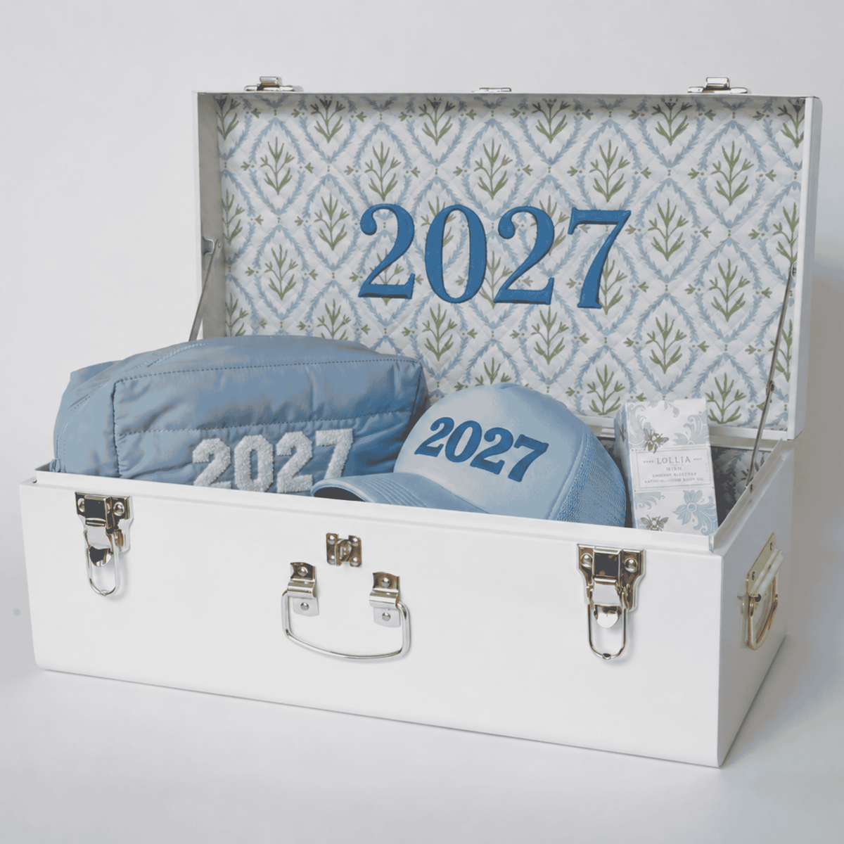
Our Light Blue trunk exterior sits in this same family, a real color you can build a registry around today rather than wait on a new fabric run for.
Building the Full Palette
A full palette built on these three colors works best when one of them leads and the other two support it. Three combinations worth building a wedding around:
- Wine and chocolate, cream leading. Deep wine and chocolate brown as the two main colors, cream or ivory doing most of the visual work in linens and florals, with copper or gold hardware pulling it together. This is the most formal of the three and the easiest to keep from reading like a Halloween palette.
- Powder blue and chocolate, gold accent. Powder blue as the standout color in bridesmaid dresses or a single floral moment, chocolate brown in the supporting details like menus and place cards, gold in the small metal touches. Reads classic rather than trend chasing.
- Wine and powder blue, the pairing The Knot points to directly. Deep wine doing most of the work in the wedding party and linens, powder blue reserved for the groomsmen's ties or the invitation suite, against a warm ivory base. It is the one combination here with the most data behind it.
Whichever combination you choose, keep one rule every source above agrees on: these colors work as accents against a neutral, not as the entire palette. A room built only from wine, chocolate, and powder blue can tip precious if the blue leads instead of supports. Let wine or chocolate carry the palette and save powder blue for one clear moment, and the same three colors read rich instead of saccharine.

Keeping the Palette Past the Wedding Day
A wedding palette this specific is worth saving past the day itself, and it is exactly the kind of detail that gets lost first. Swatches get thrown out during cleanup. The exact wine you chose for the linens gets remembered as just red a year later.
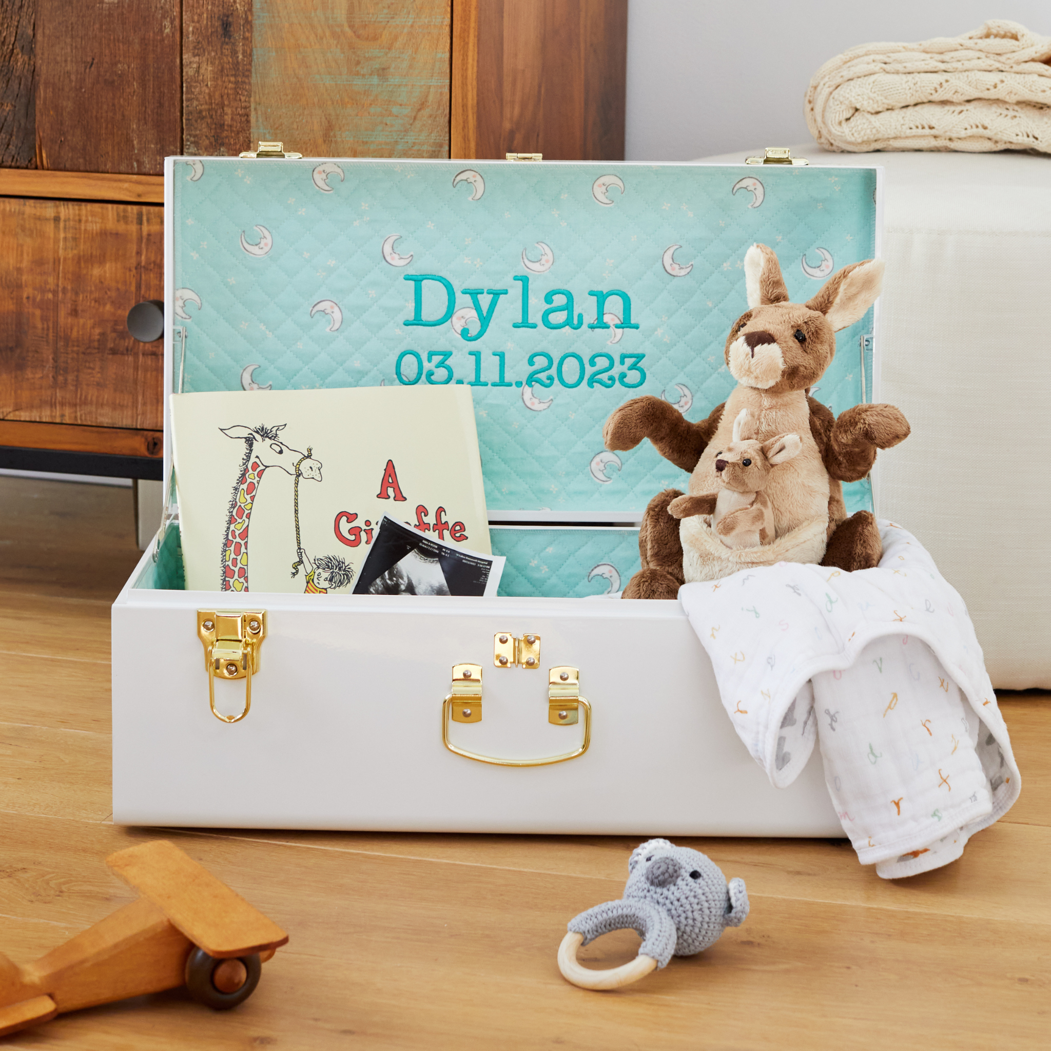
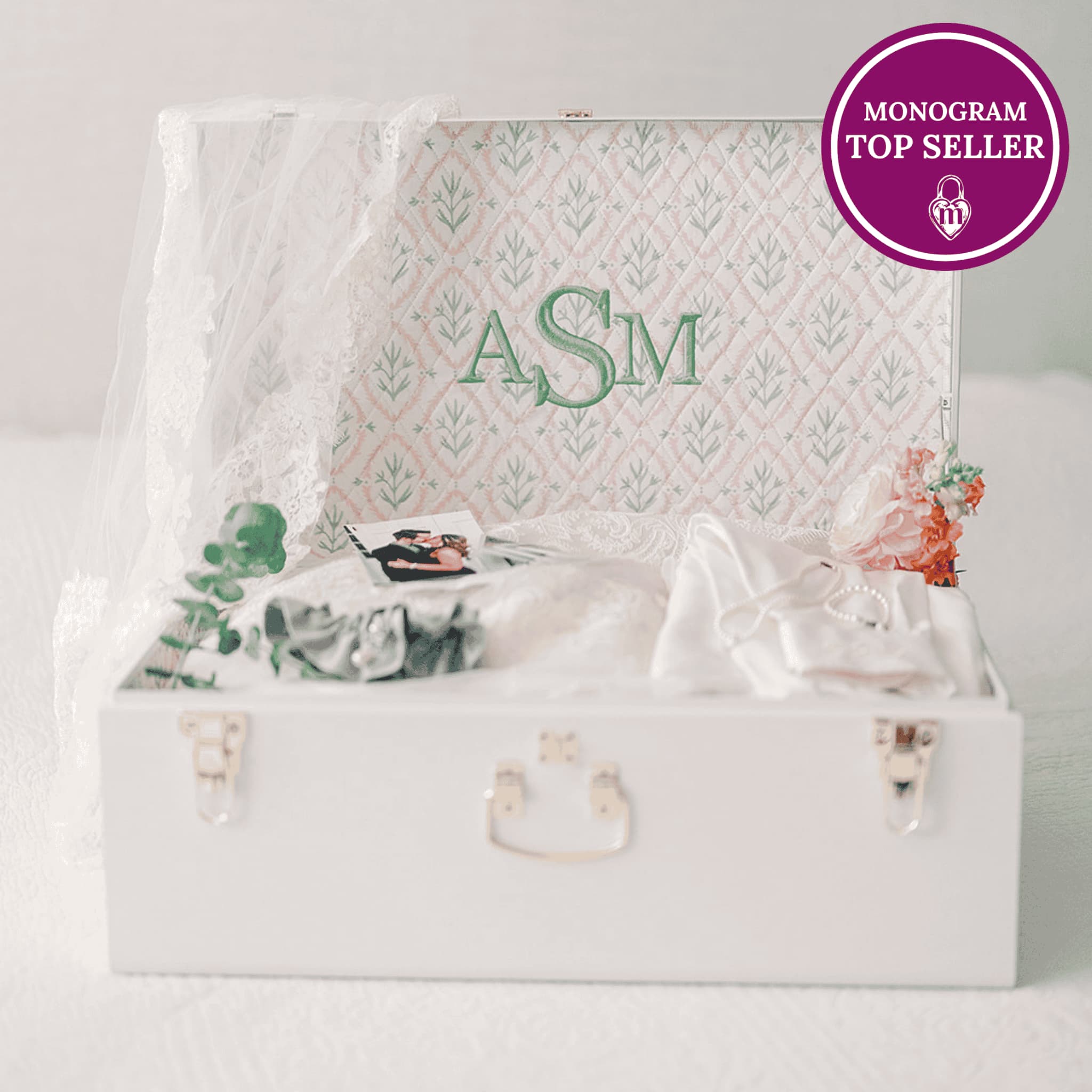
If you are building a palette around wine, chocolate, and powder blue, save the actual materials: a fabric swatch, a ribbon sample, the paint chip from your florist's mockup. A keepsake trunk built in a fabric or exterior from the same family, Bordeaux Chateau for the wine leaning palette or a Light Blue exterior for the powder blue leaning one, does double duty: it holds the rest of your wedding keepsakes and keeps the color story going after the flowers are gone. Chocolate brown lives here too: our embroidery comes in a chocolate brown thread, so a monogram or date on the lid carries that third color even before a dedicated chocolate fabric joins the collection. For what is actually worth keeping from the day itself, our guide to what to save and what to skip is a good place to start.

Soft neutrals had a good run. 2027 wants a palette with more weight to it, and wine, chocolate, and powder blue deliver that without tipping into costume territory. Pick one to lead, let the other two support it, and keep a cream or ivory base doing the quiet work underneath. That is the version of this trend that still looks intentional in your photos ten years from now.